After the death of George Floyd and the uproar and conversation that was happening in my social circles (virtually and on social media), I felt compelled to do something, and as a white male living in an affluent suburb, I wanted to do something that was genuine in the face of systemic inequity and not just give lip service until the next thing came along (the pandemic, ousting Trump, the return of school). My answer was art — creating something new that would last and hopefully spark discussion and thought.
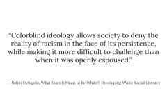
In reading and talking about race, the concept of white people saying that they were “colorblind” — that they did not see a man or woman as black or brown or white came up numerous times with the general consensus that while saying you are racially colorblind may be an “ideal” state for some, it also takes away from the uniqueness of each of our backgrounds/histories and upbringings. The question could arise: if you don’t see differences in color, then what color is everyone to you? These ideas are well articulated in How to Be an Anti-Racist by Ibram X. Kendi, although it may be too academic for some (and not academic enough for others).
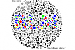
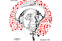
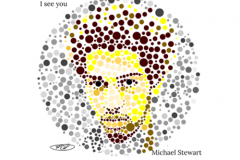
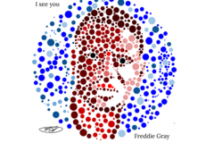
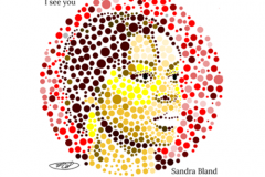
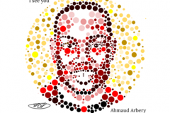
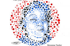
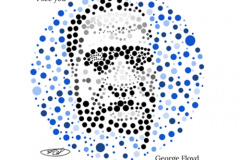
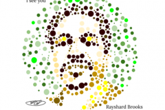
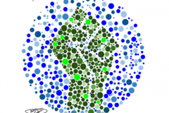
As a child, I was tested as being red-green color blind and it struck me that it would be appropriate to appropriate the concept of colorblind tests with seeing each other’s color and uniqueness by creating a portrait of George Floyd.
It took a while to do the first one. I tried a few different programs and called a graphic designer friend to see if there was a shortcut that he knew of, but in the end settled on the simplest of them all for a former sales and marketing guy: your basic presentation software. I had Google Slides loaded and made a bunch of little circles of varying sizes and colors, then overlaid them on an image of George from the web. For his portrait, I chose an image created by Rafael Salazar on Fine Art America. Once it was completed, I used a mural of Breonna Taylor as the foundation for her portrait. For all the rest of the portraits so far I’ve used pictures of the dead from news outlets found through a simple Google search.
(Editor’s note: Stringer’s images are based on the Ishihara color perception test developed in 1917. Click here to try the test yourself, and click here for the solutions.)
Click on the arrows under the gallery to view the images:
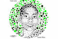
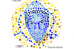
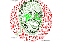
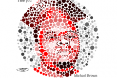
[…] second set of images we’ve published in the Lincoln Chipmunk by Rob Stringer. The first from October 2020 focused on Black people who were murdered; these newer ones are “pieces of those who are an […]